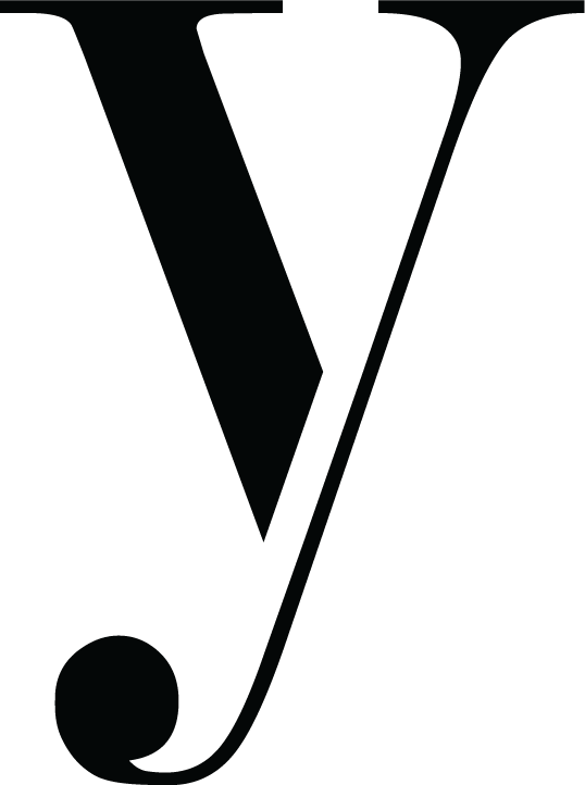
I created this personal logo for my husband and I to use
For this project I set out to create a personal logo that both my husband and I could use. I wanted to try something that was not solely type based and that was vector based using Adobe Illustrator. I am a photographer, videographer, graphic designer, and data analyst. Thus, I needed a logo that was versatile. My husband Justin and I sometimes work together so I needed something that could represent both of us. He is a mechanical engineer.
I started off with some sketches. I began trying to do something with a ‘J’ and an ‘L’ (for Justin and Loren).
What you see below are some of my first vector attempts.
After receiving feedback from my peers, I soon realized that what I had intended to be a ‘J’ and an ‘L’ were actually an ‘H.’ After that realization, I began with what you see below. I decided to just do my own initials to make things easier (Loren Yarrington).
Using the cursive versions of my initials I began to see an orca chasing some fish.
It was brought to my attention that most people could not tell what was going on with what you see above. The couldn’t see the orca until they had been told what it was. The ‘L’ and the ‘Y’ were also lost in the illustration. Eventually, after lots of critique, I decided to just ditch the orca altogether and stick with the fish.
The above logo had neither creative typography nor was it versatile. When viewed small, the fish were difficult to see.
I began again. I sought the advice of my peers and after some more sketching I found something with more creative potential using the Y of my last name.
Here is my vectorized version:
I feel like this represents my husband and I well. ‘Y’ is the first letter of our last name and the block letter seems to add masculinity to the femininity of the vine with leaves.
After some more critique, it was pointed out to me that the highlight on the ‘Y’ as well as the leaves were hard to see when small. So, I nixed the highlight and got rid of some of the leaves so that I could make the remaining leaves bigger. The result and final personal logo are what you see below.
Check out this blog post by Bogdan Sandu on how to create your own personal logo. I loved this lightbulb logo with the ‘r’ as the wires.


